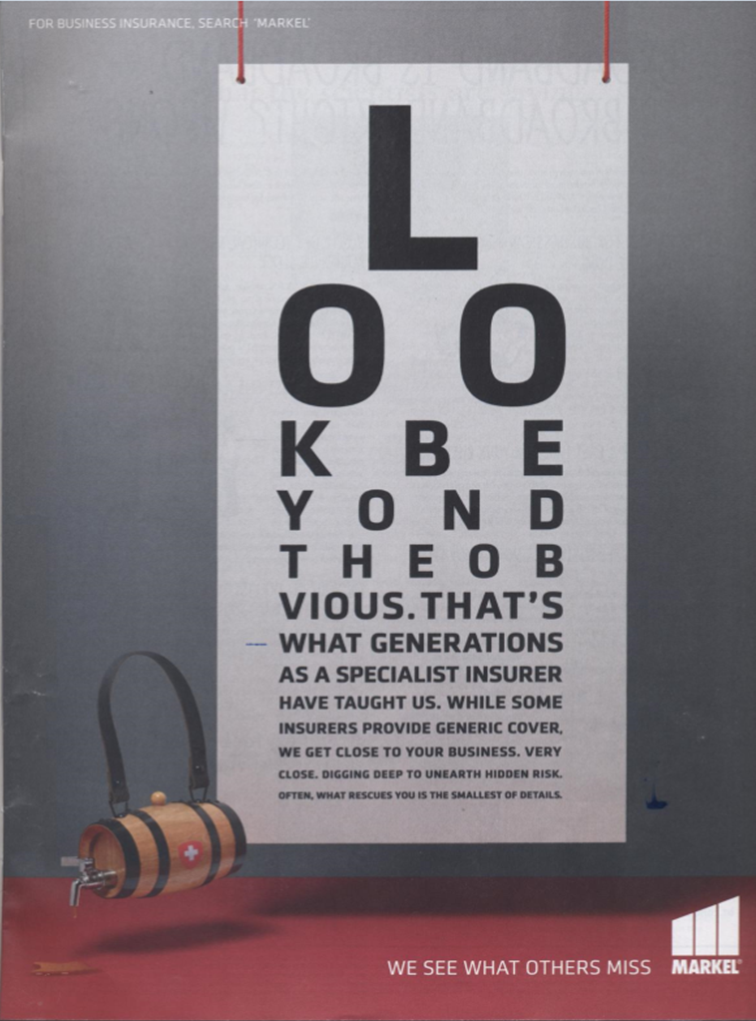
Look at the picture for two seconds.
What is the ad about?
I ask because the average ad is looked at for a second or two before the scanner decides to read on or not.
That is why David Ogilvy said that when you have written the headline you have spent 75% of your money.
This ad has no headline. Ogilvy called such concoctions "headless wonders."
Even if you did start reading the copy is dire.
But never mind the words, what about the visual?
1. The designer thinks his job is to be clever. It is not. Layouts should make the message easy to take in.
2. A technique which makes people think of an eye-test could (conceivably) make sense if that's what you're selling.
3. Except that is not what is being sold - and besides being damned hard to read ...
4. Not in a million years would this visual suggest insurance.
5. Illegibility is not the high road to anything but bemused frustration among readers.
6. The firm that is paying for this ad - which has been running for quite a while - would know, if they bothered to measure, that it is a complete waste of money.
I spend almost as much time trying to understand what makes stuff easy to read as I do on the words themselves.
I suggest you do, too, because most designers haven't a clue.
And for a small investment, you can join my membership club, and I'll show you how to.
Best
Drayton
Look beyond this designer next time you want an ad 🙂
I feel I should say that the ad is not as bad as the rule book would have us believe. I liked the typographic solution – the copy was to the point and it challenged me to read it – which is the reverse psychology of making it easy… sometimes it’s worth turning the sod over and seeing what’s underneath. Let’s not paint a world where rules become patents from the lips of long past Mad Men – and mental sticks to beat the designer with.
What works in Advertising is setting history in its place – thanking those who added their lifelong knowledge to it and trying new attractions, interests and desires…
Small correction: David Ogilvy said the Headline represents 9)% of your money, not 75%. See Ogilvy on Advertising, p.7. That apart, your message is right — the reader must be able to know what’s being offered at a glance.
He actually made the point many times, Philip – and in different ways. The last I saw was 85%, but what matters, as you rightly say is simple.
Most people never get beyond the headline/picture combination. Either they are sucked in, or not. I doubt if there is any proven method of knowing the percentages involved. For instance I learned in 1964 that in fashion advertising the caption to a picture of a dress was read more than the headline
The essential point to remember is that you should spend more time on the headline and illustration than anything else. If they fail, you fail.
I apply this principle to everything. Other than the sender’s name, the subject line of an email is the critical element. When I make a speech or do a presentation I spend more time thinking about how to start than anything else.
Yesterday a client sent me two videos to comment on honestly. I told him they were both going to flop because the first few seconds showed their logo, which nobody except them gives a hoot in hell about, followed by pictures of what they sell – also bloody dull.
They didn’t even mention why someone should deal with them. Many messages don’t. And the firm in question is a world leader in their field.
Amazing. And amazingly common.
At various times he gave different figures – 80% was another
Hence the old adage – “83% of statistics are made up on the spot”.
lol
Correction to my correction: should be 90%
Phillip; Thanks for the clarification. I’m a headline reader and have a file where the ones that reach out and grab are stored……………… Great headlines seem to inspire me to do my best………… I do believe it’s like….. “You get one chance to make a great first impression” Thank you again…… Bob
Probably paying this guy a lot of money too for a useless ad.
Ben; We’re looking at taking control of our own marketing………… For best results I usually hold the hand of our hired guns. I have found that I understand the customers thought processes, where his “What’s in it for me zone is, and what a good ad for our products & services looks like……………….. I’ve reached the point where I actually paste up what I want and tell them their job is to improve it and make it an awesome ad or brochure as the case my be…………………… ( With great results) Remember that only you truly understand your business & they are most awesome at the graphics side of marketing……………… My thoughts: When you give them a free hand you’ve in-effect cheated them and your company……………………….. Bob
And when you’re my age – you can only read the top line LOL
Dave
Doodle Ads
And – even from the advertising practice point of view – I suppose that barrel freely floating through the air should empower feeling of – assurance, certainty, protection, safeness, security?! Just as objects lighter than air firmly imply that their interior comprime some quite substantial material?! With such a vivid colour in the background of the ad, creating an atmosphere of vitality and happiness?! Who paid for this ad? Swiss Re?
This has to be the worse ad ever.in fact it does not look like an ad but an art work.the company is very likely flushing cash down the toilet.
As Ogilvy & Drayton was say; a bad case of artdirectoritis.
Is this a case of selling to the wrong client? The advertising company sold the ad to their client, which is probably correct, when they should be selling it to their client’s client. I am sure most of the websites you see are sold in the same way. They impress the client with lots of bells and whistles, but trying to find out something or buy something is like taking an intelligence test.
It says look beyond the obvious. Excellent, it’s saved me a trip to the optician. thanks.
Hi Drayton,
That ad has gold medal front runnings for the ‘worst ad ever’.
However, with 6 months to go and with many more clueless creatives running amok with client’s money, could be a close run thing for top spot.
Of course, it wouldn’t surprise me if that ad picked up a few nutty headed business owners as clients because of the business owner’s own detour into funny la la land, believing what they’re seeing is… ‘really cool and hip advertising so let’s belong to THAT insurance company because their insurance services will most likely be hip and cool.’
It’s a marriage made in heaven.
Two parties agreeing about their collective cluelessness.
Sigh.
Raja
P.S. Did you ever keep that ‘letter in a photo frame I dropped off at your offices?
I must apologise, if I have not already, Raja. I Have moved offices and I fear the photoframe will have been lost in the mountain of boxes I have in storage
Which was that, Raja? And which office? I am bloody useless – and lots of my stuff is in storage.
Awesome lesson! So often I learn more from the bad ones than the good.
If the ad team was following the AIDA formula, (Attention-Interest_Desire-Action)
they accomplished the first 2 parts. I just HAD to read to the bottom to find out what it was about.
The call to action is a very subtle, non-pushy “for business insurance search ‘MARKEL’ in the upper left corner.
But if they had used the verb “Google” they would have gained great SEO (search engine optimization)
as Google search loves the Google name above all else (assuming this ad was also adapted and for use on line).
Had the cask been around the neck of an actual St. Bernard rather than a phantom I would have certainly had more desire since I love doggies (wasn’t there a movie where the family had been killed climbing the Alps and they came back as ghosts, complete with ghost St. Bernard? Hmmmm. Maybe that’s the connection).
Who would know this company is a world leader in equine (yes- HORSE) insurance. That they are one of the top 5 for SPECIALTY insurance, with annual revenues over $3 Billion. That their reputation for integrity is unmatched. That their stock has risen from $8.33 per share in its 1986 IPO to over $350 a share in 2010 and is at $526.95 as I write this. That it rose by over $100 just this past year!!!!!!!!!!!!!!!!!!!!!!!!!!!!!!!!!!!!!!!
Nowhere on their web site is a clearly articulated USP (unique selling proposition) either as a company or for individual offerings. And yet they’ve grown steadily in a depressed economy (they were down to $210 a share in 2009 after the 2008 crash).
Markel-see what others miss.
This is also a lesson often ignored- and by me, sometimes. If you have a better ofering you will often survive and prosper despite appalling advertising.My partner who works in financial services has commented several times that nearly all the advertising is not only bad but irrelevant, as the people who actually determine investment choice are not those the ads are aimed it – if indeed they are aimed at anyone
Just went back and re-read the ad after researching the company. if you know already that the company sells specialty insurance, like Loyd’s of London, then it makes more sense and the reference to uncovering hidden risk and being rescued is quite clever, even though clever rarely sells (maybe only in Rap Music).
That’s the biggest lesson for me. Once you know the company and product or service inside and out – all the features and benefits and the benefits of the benefits, it’s easy to start thinking like the company. You loose your “beginner’s mind”.
If you’ve done your homework, you probably know even more about their business and customers than THEY do. But when it’s time to sit down and write, you need to write for someone who has no idea what any of who the business is or what they do for that person’s problems or desires. I can look back and see that not doing that is the source most of my failed masterpieces.
I have been working recently on material-articles, web copy, sales presentations_ for a software product for the multi-family office industry ( a MFO is a business that manages a wealthy family’s money for them).
The problem for the wealthy client is that since such practices are typically, almost universally built up around the investment adviser, the reporting the client gets ONLY reflects invested and invest-able assets. but invested assets are usually only a small part of a rich family’s wealth. What about the 40-50 limited partnerships, the car collection, the insurance for the horse farm ( JS note: call my MARKEL agent today) the wife’s allowance? Wouldn’t it be important to know about those things as well? Not knowing that stuff leaves the typical wealthy client with an ILLUSION of control, not TRUE control. And it costs them MILLIONS in hidden risk exposure, over looked assets, under/over insured assets, misplaced/lost documentation, and legacy nightmares. Not to mention that most fraud perpetrated on the wealthy exploits these gaps
My client’s software is designed to give a wealthy person the complete picture and necessary details needed to realize TRUE control. It’s the only software in the world that does that. ALL the products currently offered to the industry are financial adviser-centric, designed to meet their needs, to further reinforce the illusion of control, not built for the real needs of the wealthy family. That I can even state the case this simply has taken months of wading through industry jargon and double talk.
So this is a product designed to give clients true control in an industry/market designed ( rigged) to give the client an illusion of control.
How would you approach such a challenge? Mine has been to start with educational articles (see “What Ship Is Your Wealth Ridding On?” European Financial Review http://www.europeanfinancialreview.com/?p=6389 ) Having this to show in a recent sales presentation for a boutique private bank was worth much more than all the sales copy I’ve also written in terms of social proof and credibility. Though the client’s name is on the piece, I wrote the body and then we tweaked it together over I think 7 different versions. But what resulted is a piece easily understood by both experts and the person in the street (I tested it on both). and that was the toughest part-keeping the language simple and straight forward.
Drayton, thanks again for such a useful posting. I wish I had known your stuff 20 years ago when I started.
I am now putting up a sign that says “If you knew nothing—-would you buy”.
That maxim, “If you knew nothing – would you buy” is extremely pertinent. So much so I may do a video on your comments, Joseph; but first I am going to re-read both messages.
A comment as promised.
This point – “if you knew nothing, would you buy” – is both well-put and important.
It reaches beyond copy and is central to understanding the marketing process and the right strategy.
If anyone wants to understand – and if they don’t, they are unwise – what follows is worth reading (I say immodestly).
Someone expressed the difference between what Lester Wunderman first dubbed Direct Marketing and traditional advertising thus: “Advertising takes the horse to water. Direct marketing makes it drink.”
Neat, and appealingly simple – but dangerously incomplete.
The kinds of advertising were defined about 70 years ago by James Webb Young of J. Walter Thompson in a series of lectures at Northwestern University, then incorporated in a very good, short book called How to become an advertising man.
They were: to familiarise; to remind; to spread news; to overcome inertia and to add a value not in the product.
None of these necessarily requires you to do a “complete” selling job. In many, if not most cases, you rely on some other element – the shop assistant, the supermarket, the salesman – to take the money.
But what direct marketing can do is take someone from knowing nothing about your offering to buying it.
It is not piecemeal. It is The Full Monty, as we say.
It explains why long copy is important to you.
You must give every reason to buy and overcome every objection. Some people may know about what you are selling. But you cannot rely on selling to just some people. You have to sell to every prospect, otherwise you will not do as well as you could.
You will lose sales – and you can’t afford to.
Your competitor, who knows what he or she is doing will trounce you.
The other fact is that – as my former colleague Shelley Lazarus, retired CEO of the Ogilvy Group said in her last speech – “Today all marketing is direct marketing.”
She was referring to the overwhelming power of the medium we are now talking through – the internet.
Unless people understand direct marketing they cannot thrive on the internet.
But most give no serious thought to anything. They think being “creative” will do the trick. They will be rewarded for their ignorance as times get more demanding.
Many big firms do not do what I say. They rely on technological advance.
Look at Blackberry. Hopeless. They never even tried to explain what was good about their new gizmo, but relied on vacuous boasts and silly slogans. They have not studied.
But there are better known, very successful names that still haven’t understood what I’m talking about.
If you are in a business like phones, the margins are so huge that even a half-wit can succeed without good marketing. But for how much longer?
We live in interesting times.
Mis-leading headline / picture combinations. Top marks need to given to Aberdeen Asset Managements new (global) campaign.
For Example;
Headline:We dive deeper.
The sheer mindless folly of most advertisers in Money Week, aiming to sell in what I guess is the most lucrative market around never ceases to mystify.
Why do they persist in using lines and pictures that at first glance have nothing, absolutely nothing, to do with what I guess most people want – to make more money or protect what they have?
I say “at first glance” because there is no second glance. Either you grab people instantly, or not at all. Your next chance is when they see the ad again; and each time they do the likelihood of response diminishes.
I say that not as opinion but as fact based on response measurements – though few ad agencies know it is so.
Look at Baillie Gifford’s advertising.
One ad has the heading “Freedom to roam” with a picture of a cowboy in a desert. Are they selling to cowboys?
Above the picture it says WE LIVE IN A PERIOD OF EXPONENTIAL CHANGE PROVIDING FANTASTIC IOPPORTUNITIES FOR STOCK PICKERS LIKE US”.
What utter guff.
We live in a period where it is damn difficult to find any genuine opportunities.
Another ad shows a tiger, with the line “Following our instincts”.
Angels and ministers of grace defend us. What the heck has that to do with a benefit for me?
So true. One of the biggest challenges I face with many clients is trying to convince them of what works. I had one client, the Professor, whose web copy was so over the top intellectually, that I had to read the home page 3X and still didn’t understand what he did or why I’d want to buy it. Another speaks her own spiritual language and makes up her own words that she needs a glossary on every article and every page! Its challenging to impress upon them that simplicity is best.
And then there is trying to get them to understand the concept of a target customer profile – or avatar, which is marketing 101.
Cheers {:>
SallyO
Great article. And terrible advert. I’ve been looking for examples of dreadful ads (and good ones) for a course I’m putting together. This fits the bill perfectly. Thanks also to Joseph for “If you knew nothing, would you buy?” I’m pinching that for sure.
I’m lucky; many of my clients trust my judgement and expertise when it comes to ads (and marketing in general), so I don’t have to deal with this sort of thing often. However, one of my clients is a creative agency and they turn out stuff like this. It’s infuriating, and I’m on the verge of giving up working with them. Whenever I try to offer suggestions, I hear “I’ve been doing this for 20 years.” With the subtext being that I’ve only been running my own business for a couple of years. So I can’t possibly know better than him. Except, I do. Because I know people. But more than that, I study advertising ALL THE TIME. The good and the bad. People like you, Ogilvy, Caples, Maslen… and I test (whenever I can convince clients that it’s a good idea). How do you argue with, “I’ve been doing this for 20 years”?
“With idiots even God is helpless” – Goethe
My argument: “Would you say an author who has written 20 books a good author?”
Depends who he was and what he wrote. Both Zola and Dickens wrote well over 20 books
Ask is that 20 years’ experience…or 1 year’s experience repeated 20 times?
Eye doc ad ..lol..if not well Then I would agree they need help .
Actually for the ninth month of AskDrayton – just for a little fun and knowledge – I’ve spent 23 minutes analysing a whole slew of ads in one publication – Truck and Track – which I think has more unadulterated rubbish ads in it than anything I’ve seen for a long time. Not one is really good and most are ghastly. I boggle to think that any of the people who put them together got paid.
Drayton. Remember the Silk Cut posters??? And to a certain extent Benson and Hedges although they did have the branding hidden somewhere. Great campaigns in my view.
Guess what? I worked on those brands.
No surprise there. Collett Dickinson Pearce??
Are you talking about the ad? No idea who was guilty
Many thanks Drayton, very educational
Drayton — you’ve spent so much time and energy panning this ad. The simple fact is, you noticed it amongst all the other written material we get bombarded with each and every day. That, in itself, means that the ad had cut-through with you. And now you’ve drawn the attention of a lot of other people to it!
True, agency Art Directors can be a pack of w*nkers (and most that I have met would be the first to admit it). True, advertising of this type is a risky strategy and there is a real possibility the ad will fail. But if you do it right and have the correct supporting marketing material it can be very effective. In this case the tagline by the logo supports the copy (the eye chart is not actually the headine). Or did you miss this?
As the insurance company are continuing to run the ad, I would suggest that it’s working for them.
I notice bad ads only because I am interested in ads, not because I am a prospect. An important distinction, to say the least. What interests me professionally has little to do with what real people would notice..
I forgot to say that I will wager the fact that the firm kept running the ad had nothing to do with it working or not. Hardly any of these firms measure response, let alone sales resulting from it. Their agencies say they are “building the brand”.
Drayton your insights are wonderful and have really got me thinking.
I read; “It explains why long copy is important to you.” And, “You must give every reason to buy and overcome every objection. ”
As a commission only freelance sales rep it makes me think my sales email (sent after a cold call to a busy professional photographer) should be long, in order to address each reason to buy and pre-empt objections. But I must say I struggle with the idea that because today people read so much email on pocket gadgetry that a long sales email might well put them off reading it in the first place!
Would you and your copy writing readers mind telling me if you would lean toward the longer all encompassing copy in a sales email, or a briefer message?
Thank you in anticipation, Lucy
I do not envy you, Lucy. I was a rotten salesman on the phone and in person. Too shy.
The trick (and the catch) is of course to write something interesting, Lucy. Not easy.
Also you are selling something visual. The pics have to be able to speak for themselves, but you have to be able to say something interesting about them. What challenges did the photographer face? What makes the work excellent?
Another point to bear in mind is that often we will use short copy emails to lead to long landing pages. You will probably see later today an example. I am about to write a short email leading to fairly long blog I have almost finished editing
Thank you for your thought and reply Drayton 🙂
We actually sell advertising space to the photographers, so you know. They sign up and send us their pictures to promote online.
I’m going to mention your landing page idea to my boss today and will be looking out for your blog!
You are absolutely right, the ad is the worst of the worst!
I think you’ve failed to realise that copy is written by copywriters not designers. Designers take direction from the client – it’s very possible that the client had a strong idea of what they wanted visually. The design agency very possibly advised that it doesn’t work, but someone else decided it would. If any of you actually work in a creative industry I believe you’d know that? It’s so easy to critise but harder to do a decent job against a client who insists they know better.
I think I can safely say I have worked in what is fondly imagined to be a creative industry. This is actually my 59th year as a writer. I agree; the world is full of idiot clients. I found there were only two solutions. 1) Try to work with intelligent clients – or at least ones that realise they don’t know your job better than you; 2) Make it your business to educate them. There is quite a lot of stuff around about what makes stuff readable – or otherwise
In my experience, designers don’t understand how advertising. Art Directors should – but only the good one’s understand that the images, pictures and layout are there to serve the message. John Hegarty explains his understanding of the difference between designers and art directors in Hegarty on Advertising when he says that (he thinks) “designers see themselves as artists. Heaven forbid they should soil their hands on commerce”. I think designers do think commercially but they want to make things look nice or visually arresting – few understand what a proposition is. I know, I used to be a designer.
It is very hard to resist showing off – whether one is a designer or a writer. I find myself doing it all the time.
I wholeheartedly agree with most of the points above. Just to play devil’s advocate, one criticism I find strange is that “this ad doesn’t look like an ad”. That’s true, but that’s not why it fails. Who was it that said that newspaper ads that look more like editorial pieces are far more likely to be read and responded to? Surely ads shouldn’t look like ads. People don’t want to be sold to. They don’t want to answer their doors to a person saying, “I’m here today to sell you something”.
Drayton,
Regarding your ealier comment, may I suggest that the focus should not be on making the horse drink, but to make it thirsty. Isn’t this what advertising and direct mail is about?
Regards
Gerald
First you remind the horse that it is thirsty. Then you make it drink.
“When people have read your copy they want to know what to do. Tell them.” – John Caples, in a Wall Street Journal Interview
No Drayton. The horse will decide if it wants to drink or not. You can’t make it drink. In the same way you can’t motivate any other animal. At best you can stimulate or inspire. So make the horse thirsty, then show it where it can drink. Hopefully from your well.
You are probably smarter than me, Gerald, but I made about $2,500 yesterday in about an hour by making horses drink rather than tell them how thirsty they were.
Good on you Drayton
Nice to see you have not lost your sense of humour !!!!!
“You cannot teach a person anything, you can only help him to discover it within himself”
Galileo Galilei. Italian physicist, mathematician, astronomer and philosopher (1564 – 1642).
People will change when they want to, not when they’re told to. A smoker won’t desist because she’s told to, they have to want to. If we take your position then running Ads telling people what they should do would be highly successful.
You may have made some money, but how many people did you have to “tell” and did everyone you told take up your offer? At best, we can promulgate information in the most persuasive manner, but it is the recipient who will decide to act.
Absolutely. The idea that marketing can create demand is utter nonsense. The most we can do is bring to people’s attention desires they may not have considered important enough to act upon
When you are as money conscious as I am and always looking to get as much for your buck as you possibly can you don’t have time to decipher strange ads. Rather deal with people who are to the point and clear about what business they’re running. Im not willing to work so hard to give some company my hard-earned cash.
Question is did the ad work? What were the results ? What was the response rate?
As it’s not my business, I have no idea. But if it did I’ll just forget everything I’ve learned over the last 50 years
what do you think?
There are so many bad ads nowadays that it’s had to state this was the worst. To take one example, if you subscribe to Money Week you will see that 9 out of 10 in there are appalling.
This is so f*cking ridiculous. I am a graphic designer (freelancer) and I see a lot jargon designers love this type of ridiculous ads. By the way Drayton do You know Massimo Vignelli designer – if yes, what you think about is work? He is responsible for the logo of American Airles, NY metro, and more: http://www.vignelli.com/
I like his approach because he strives for elegance.
And I think the elegance with good marketing can be a solution.
I like what he says about typefaces.
Thank You for your answer. Greetings from Portugal.
If you allow me, here it is what the Designer Massimo Vignelli said:
“I never work with middle management.” “Middle managers are dominated by fear of losing their job, and therefore they have no sense of risk. I always work with the top person, the president or the owner of a company. That’s it. Only the person at the top can take risk. He’s used to it. That is how he got to the position he is in. He understands what you are doing, and he doesn’t have to report to anybody. He makes his decision, and that’s the way it goes.”
I see the same thing happens with Marketing.
The guys who approve the Marketing are managers not Ceo’s – or worst, they are a new young arrogant idiot CEO of a new Startup that want to do a “Manifesto” and the way to do is “cute/smart Advertising” . But fortunately there are a solution to good Marketing.
P.S – I am a graphic designer by graduation, and I guarantee you guys this silliness happens in both Design field and Marketing field.
That reminds me: I need to go for an eye test.
“Should of gone to Specsavers”, sprung to mind as soon as I saw this ad. I then thought that perhaps it was leading to a joke or punchline, as so many of this type of ‘eye test’ ad actually do.
But it is selling insurance!
I had absolutely no idea who Markel is so I’d assume that unless you knew what you were looking for, then this ad would confuse the majority.
Is it a targeted ad? Was it placed in and amongst competitive ads? Was there any additional copy that relied upon SEO to direct specific viewers?
If this was a ‘blanket ad’ to appeal to the general population then I suspect that it didn’t grab or reach most mortals who buy insurance through ads like the Go Compare dude – annoying but very memorable.
The arguements raised about the creatives knowing better. I would just compare these to Architecs and Construction Engineers. One thinks it will work. The other knows if it will work.
Unless there is an intervention then the results can be catastrophic and/or costly.
Thanks Drayton. You are a diamond amongst coal.
P.s – I was also going to say that you are a breath of fresh air amongst these new blogging millennials who’s marketing advise sucks but then I remembered that you are as old as the hills and not much has changed in marketing since you were a lad. So a breath of tan and leather would be more apt – thanks.
Too bad for this advertisement.
Too bad for ad’s copy, as it lost the chance to make clear the brand positioning.
As a matter of fact, if a person could be able to read the copy, would have caught the contraposition with brand’s competitors and brand’ reason why.
P.S. could somebody tell me what’s the ad’s year of publication?
Thanks a lot, and sorry for my bad and italianized english. 🙁
It’s about 5 years ago.
I thought the ad must be for a chain of opticians. That would be the only justification for the style – though even then its a weak one. But again, no connection to the product. There’s a slight curiosity factor, but only for so far. I gave up reading after the first three lines. It might work where the audience is captive eg in a tube train or lift. But it doesnt grab the reader beyond that, its just someone trying to be clever.
To Drayton’s point about creating thirst before leading to the drink: when I was about 9 years old, my dad asked me to take Naomi, one of our Belgian draft horses, to the watering trough. No matter how hard I tugged, she wouldn’t budge. Must have been funny to see a little boy trying to pull a Belgian draft horse, because my dad told me to stop goofing off and get the horse to the trough.
“Dad, you know you can lead a horse to water but you can’t make them drink!”
“Go break off a chunk of that salt block, give it to the damn horse and see what happens!” he said.
If you’ve ever seen a little kid getting dragged to a watering trough by a Belgian draft horse, that is damn funny to see…must have been because Dad was doubled over and couldn’t catch his breath.
That’s exactly what good advertising does: creates a lust in the prospect for the offering that is so great they’ll rush in, often dragging the hapless and ignorant marketer along with them.
Drayton, I wish I’d discovered you 20 years ago. The value you provide my team daily is massive- and the creative review Gerald did for us on our work has changed the course of our company and at lightning speed!
Dear Drayton, I sharing 100% your comment and way of thinking. Now, because it’s so bad and ugly it maybe work for, which is unlikely but not all impossible according my experience analyzing similar cases for my clients. Greetings and thank you very much for sharing your wisdom.
I agree that it is one of the worst ads I have ever seen. But I would like to hear your opinion on a VW “Think Small” ad. It never became clear to me why this was considered one of the best ads of the twentieth century. My personal opinion is that this VW ad is also in the “worst ads” category.
Drayon I agree its shite, 1 second and I didt want to read another letter.
It’s reminded me that I haven’t been to the toilet today.
I can imagine my old boss, John Watsons reaction to seeing this. He’d simply roll his eyes. That would be enough anyone in the room that ‘It’s poor, very poor.’
Noted Drayon!
A huge amount of wasted there “Many designers thinks the job is to be clever not. It’s not”
Noted!…